October 31, 2007
It was only a matter of time
September 17, 2007
Text and Balloons: 6 Advanced Techniques
Now that you know all the rules about text and dialogue balloons, I am going to tell you how to break them.
Janet and Alice (Brad's secretary, and Janet's alleged lover) will demonstrate.
1. Overlapping Balloons
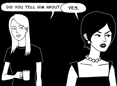
This is a common and effective way to show characters interrupting each other.
If you don't want it to look like your characters are talking over one another, you need to keep your balloons separate. No exceptions. If you need more room, draw your panels bigger.
2. Tiny Text

Abruptly switching to a smaller font size for your character's speech can make a powerful statement. How your readers "hear" the dialogue will vary depending on your character's expression and body language.
But if you use this technique too often, or inconsistently, it loses all of its power. So be careful.
If you want to shake things up a little bit, you could also use:
3. Huge Text
This should be pretty self-explanatory.
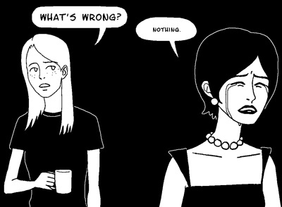
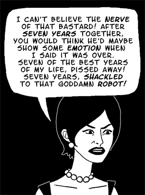
4. Huge Balloons with Minimal Text

This is a good technique to bust out in uncomfortable moments. The visual weight of all the extra white space indicates an extra emotional weight behind the words. Like the previous techniques, it also affects how the reader "hears" the dialogue. The empty space surrounding the words is interpreted as empty time passing by— as if the words were bracketed by ellipses. "...Nothing. ..."
Because huge balloons are such attention-grabbers, you should avoid using them in combination with any of the other rule-breaking techniques. Also avoid pairing them with dramatic camera angles, exquisitely tortured facial expressions, or extended monologues.
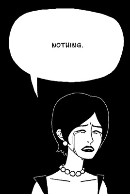
Like that. That's too much. Now it just looks silly.
If being silly was your intention all along, though, feel free to use and abuse your huge, empty balloons however you like.
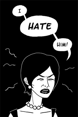
5. Huge Balloons with Maximal Text
Got a character launching into a furious diatribe? Want to play it for laughs? Fill up 50% or more of the panel with a single balloon full of their incoherent ranting. You can also emphasize random words for extra hilarity. Bonus points if characters in the background are being physically pushed out of the panel by the enormous balloon.
6. Packed Full of Balloons

A balloon-heavy panel accomplishes two things: (1) it lets your characters' dialogue take center stage, and (2) it makes the reader feel slightly claustrophobic. Very useful for dramatizing intense arguments. You have to be careful not to let the art compete with the balloons, though. I used a white background for this panel to reduce the overall contrast in the image, and also made the outlines around the balloons slightly thicker than I normally do, so they would have more visual weight.
Just how balloon-heavy is balloon-heavy?
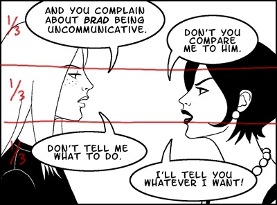
Roughly two thirds of the entire panel is taken up by the balloons. The open area is centered around the most important part of the artwork, Alice and Janet's faces, so we can use their expressions to gauge how we should read their dialogue. Efficient.
The standard, non-rule-breaking way to do this scene would be to extend the panel height and let the balloons have their own space:

This is certainly an acceptable panel layout, and because the balloons aren't having to compete for the reader's attention anymore, it lets you get away with bolder stylistic choices in the artwork. But it also forces you to draw everything smaller so you can fit both the characters and the balloons inside the borders, and this reduces the emotional impact of the panel. So I don't think it's the best choice for a dramatic exchange of words.
Of course, if you have panel after panel of nothing but tiny talking heads squished between dialogue balloons, you will wear out your readers.
Moral of the story: Rule-breaking techniques are your aces up the sleeve, so deploy them judiciously. Keep them behind your cuff until you're good and ready.
That's all for today!
August 29, 2007
Dialogue Balloons: a User's Guide
Down to business.

Dialogue Balloons are good, and you should use them in your comic. They are an unfortunately imperfect tool for representing speech in an image, but they are the best tool we've got.
So don't try to get away with half-assed crap like this.

I hope I don't have to explain how terrible that looks.
Here is how to properly operate your dialogue balloon.
SIZE
Balloon versus Text
As I said in Text Triage Unit No. 2, you should make your balloon big enough to give the text some breathing room around the edges. Don't vacuum-pack your text.

Balloon versus Panel
Panels should never be more than 40-50% filled by a single balloon. All that white in one area is visually jolting, and distracts the reader from the image. So don't let this happen.

If you use multiple balloons, though, you can get away with cramming a bit more text in.

That's not a perfect panel, but it's a workable one.
SHAPE
The standard balloon shape is somewhere in between an ellipse and a rounded-off rectangle. You should adhere to this standard.
If you use an image editor to letter your comic, be careful with the ellipse tool. If you square up your text well, putting an ellipse around it will work just fine.

But if you have a long narrow line of text, it can look very awkward.

It's amazing how many professional comic artists and letterers still haven't realized this.
Non-standard balloon shapes (like squares or wiggly blobs) are inherently distracting, and therefore best used only when you want to draw attention to a particular "voice." For instance, if you have a robot character, using perfectly square balloons for its speech would convey a rigid, synthesized voice. You could also use square balloons when a human is talking through a machine such as a phone or a radio.

Or, you know, whatever.

TAILS
Do whatever you want with your balloon tails. As long as they're pointing in the approximate direction of the speaker's head, I don't really care.
LINE
The line bordering your balloon should be thick enough to see, but not so thick it's distracting. 1.5 to 2 times the line weight of your artwork is a good guideline. It should also never be thicker than the panel border (unless of course you used a borderless panel).
Too thin:

Too thick:

Borderless balloons are also a viable option, as long as they're clearly distinct from the background.

OVERLAPPING
Should you allow balloons to overlap your characters, or not?
There's no correct answer. Manga artists have no problem with overlapping. Western artists typically avoid it. It is up to you to decide.
Personally, I think that keeping characters and balloons rigidly separated also keeps your readers more emotionally separated from your comic, because it limits what you can accomplish with close-ups. But you should go with whatever makes you feel comfortable.
August 16, 2007
Oops
August 12, 2007
Text Triage Unit no. 2: The Illustrated Safety Manual
Brad and Janet Noir, our unhappy couple from last time, will demonstrate.
1. Don't make your text too small.

2. Don't use an inappropriate font.

3. Don't condense your linespacing or letterspacing.

4. Don't put too much text in a single balloon.

5. Don't treat your balloons as if they were shrink-wrap for the text.

6. Don't carve your balloon into a jigsaw around the text, either.

7. Don't break up your text in unnatural ways.

8. And lastly, don't leave your text aligned to the left.

Hopefully why you shouldn't do any of these things is self-evident.
Just in case it's not, though, I'll explain: it looks like pure hell, and it makes it harder for me to enjoy reading your comic.
And I really, really want to enjoy reading your comic.

August 10, 2007
Text Triage Unit
There is one overriding rule when it comes to text, and it is this: if I can't read your text, I'm not going to read your comic.
So don't make your text too small for me to read it without squinting. Don't put too much text in a single balloon. Don't shrink the space between lines so you can cram more text into each balloon. Don't draw your balloons right up against the edge of the letters.
And for the love of god, don't do this.
Text should be big, clear, cut into small chunks for easy digestion, and have plenty of breathing space both between lines and around the edges. Like this. See how easy that is to read?
A Word About Fonts
Arial, Comic Sans, Times New Roman. DON'T USE THESE. In fact, don't use any font that came preinstalled on your computer. Why? Because they're ugly. They're also hard to read. They were never meant to be used in comics. They look amateurish. But mostly, they're just ugly.
There are a variety of free fonts specifically designed for use in comics, readily available from sites like Blambot. Pick a good one from their list-- NOT "Anime Ace", that one looks like crap too-- and use that instead.
A Word About Linespacing
If you letter your comics in MSPaint, then close your browser window right now and walk away. Your comic cannot be saved. It is DOA.
If you letter your comics in a proper image editor, though, you probably have the ability to tweak something called "linespacing."
This is how you do it in Adobe Photoshop (although the same technique applies for Illustrator):
Once you've got your text banged out, hit Ctrl + T to bring up the Character palette. The little icon with two A's on top of each other stands for linespacing.

Most of the time the (Auto) setting is good enough, but for maximum readability you may want to dick around with it. I prefer to err on the side of too much space between lines rather than too little, so I usually set linespacing to be a size bigger than my actual font size. In this case, my font is 18 point, so my spacing would be 24.

That looks better. But remember, not all fonts need to have their linespacing screwed around with. Use this technique sparingly, and use it for good, not evil. NEVER EVER use it to cram the lines closer together so you can pack more dialogue in.

That's all for today. Next up: balloons.
let's do this
The good news is that approximately 90% of all bad webcomics are making the exact same mistakes. Most of them are about basic legibility. The words are too small. The art is confusing. The panel layout is labyrinthine. These are the easy ones to fix. I will show you how.
The bad news is that the remaining 10% are perfectly legible, and still manage to suck. It may be that many of them are beyond hope. But goddamnit, I've got to try.
