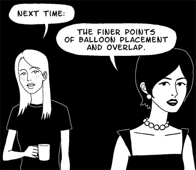
Now that you know all the rules about text and dialogue balloons, I am going to tell you how to break them.
Janet and Alice (Brad's secretary, and Janet's alleged lover) will demonstrate.
1. Overlapping Balloons
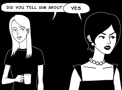
This is a common and effective way to show characters interrupting each other.
If you don't want it to look like your characters are talking over one another, you need to keep your balloons separate. No exceptions. If you need more room, draw your panels bigger.
2. Tiny Text

Abruptly switching to a smaller font size for your character's speech can make a powerful statement. How your readers "hear" the dialogue will vary depending on your character's expression and body language.
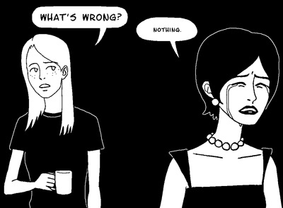
But if you use this technique too often, or inconsistently, it loses all of its power. So be careful.
If you want to shake things up a little bit, you could also use:
3. Huge Text
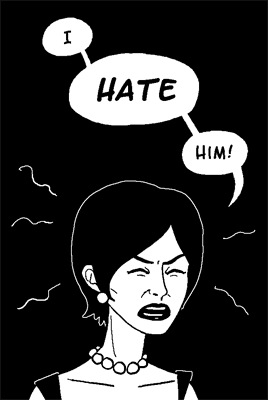
This should be pretty self-explanatory.
4. Huge Balloons with Minimal Text

This is a good technique to bust out in uncomfortable moments. The visual weight of all the extra white space indicates an extra emotional weight behind the words. Like the previous techniques, it also affects how the reader "hears" the dialogue. The empty space surrounding the words is interpreted as empty time passing by— as if the words were bracketed by ellipses. "...Nothing. ..."
Because huge balloons are such attention-grabbers, you should avoid using them in combination with any of the other rule-breaking techniques. Also avoid pairing them with dramatic camera angles, exquisitely tortured facial expressions, or extended monologues.
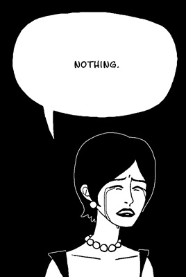
Like that. That's too much. Now it just looks silly.
If being silly was your intention all along, though, feel free to use and abuse your huge, empty balloons however you like.
5. Huge Balloons with Maximal Text
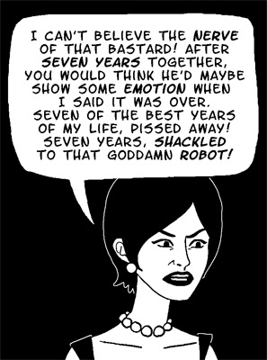
Got a character launching into a furious diatribe? Want to play it for laughs? Fill up 50% or more of the panel with a single balloon full of their incoherent ranting. You can also emphasize random words for extra hilarity. Bonus points if characters in the background are being physically pushed out of the panel by the enormous balloon.
6. Packed Full of Balloons

A balloon-heavy panel accomplishes two things: (1) it lets your characters' dialogue take center stage, and (2) it makes the reader feel slightly claustrophobic. Very useful for dramatizing intense arguments. You have to be careful not to let the art compete with the balloons, though. I used a white background for this panel to reduce the overall contrast in the image, and also made the outlines around the balloons slightly thicker than I normally do, so they would have more visual weight.
Just how balloon-heavy is balloon-heavy?
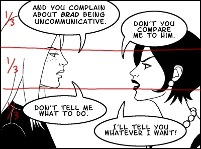
Roughly two thirds of the entire panel is taken up by the balloons. The open area is centered around the most important part of the artwork, Alice and Janet's faces, so we can use their expressions to gauge how we should read their dialogue. Efficient.
The standard, non-rule-breaking way to do this scene would be to extend the panel height and let the balloons have their own space:

This is certainly an acceptable panel layout, and because the balloons aren't having to compete for the reader's attention anymore, it lets you get away with bolder stylistic choices in the artwork. But it also forces you to draw everything smaller so you can fit both the characters and the balloons inside the borders, and this reduces the emotional impact of the panel. So I don't think it's the best choice for a dramatic exchange of words.
Of course, if you have panel after panel of nothing but tiny talking heads squished between dialogue balloons, you will wear out your readers.
Moral of the story: Rule-breaking techniques are your aces up the sleeve, so deploy them judiciously. Keep them behind your cuff until you're good and ready.
That's all for today!
